
A highly customizable Flutter UI package for building production-grade forms — includes smart text fields, password fields, dropdowns with search, flexible buttons, and a fully customizable PIN / OTP input field.
Every widget supports per-state theming with smooth animated transitions — the same pattern used by Pinput.
 |
 |
 |
 |
| Widget | Description |
|---|---|
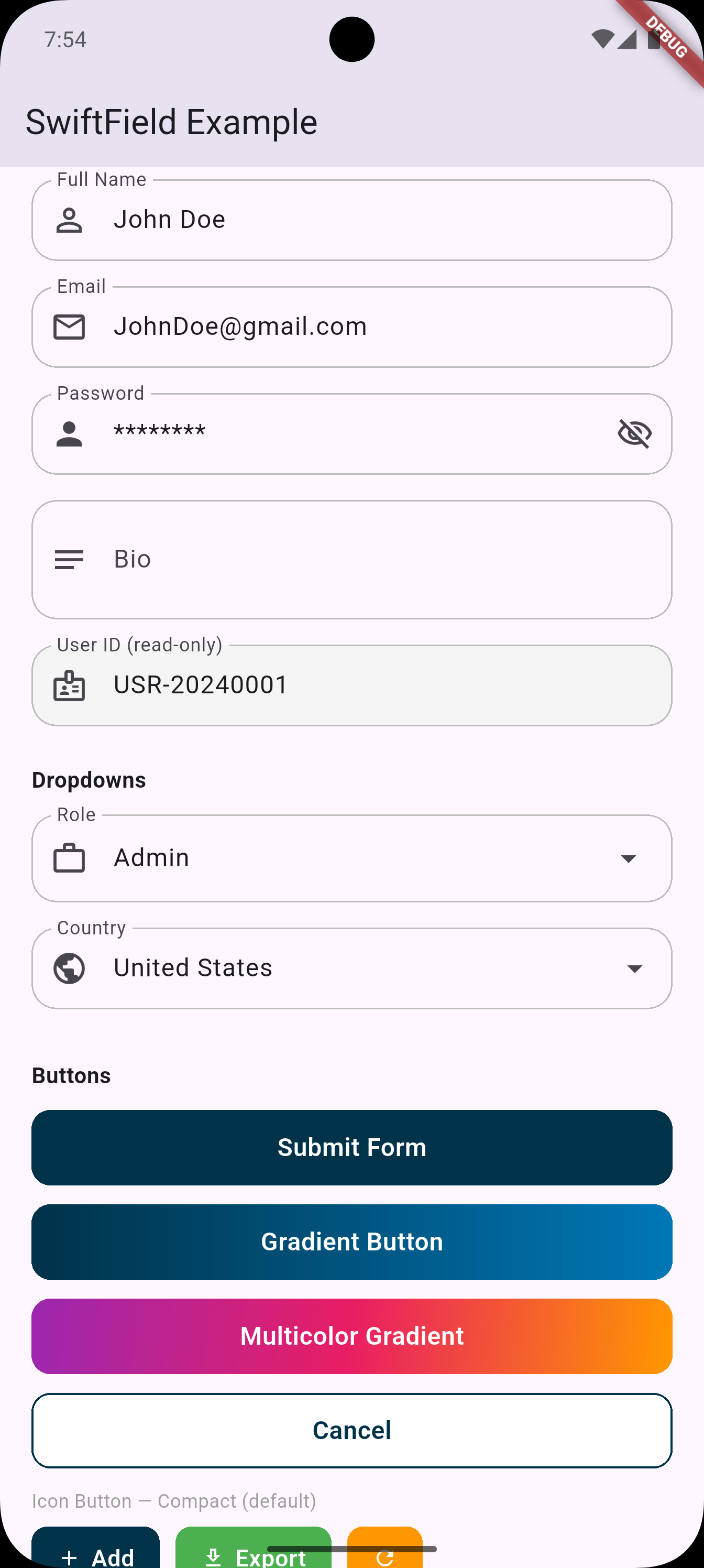
SFTextField |
Text field — multiline, read-only, per-state themes, haptics, builder |
SFPasswordField |
Password field with show/hide toggle — per-state themes, haptics, builder |
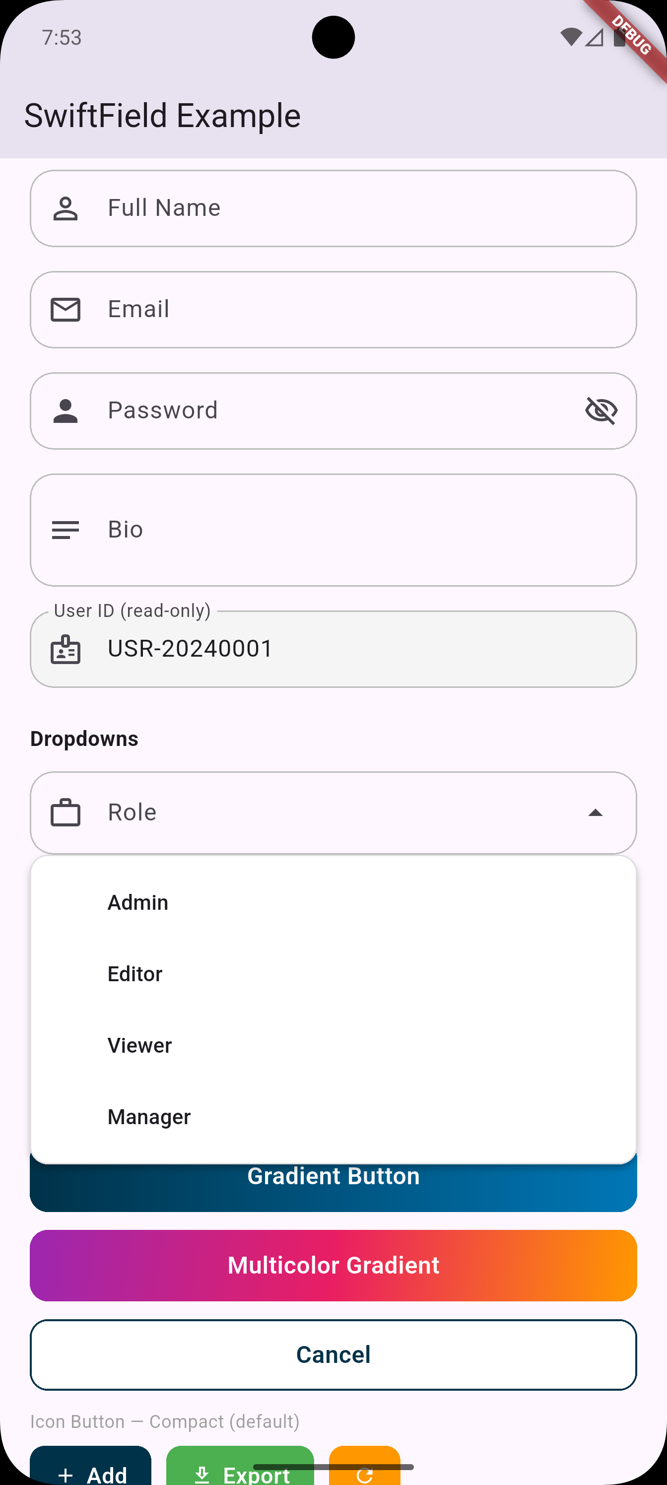
SFDropdown<T> |
Styled dropdown with responsive width |
SFDropdownSearch<T> |
Dropdown with built-in search box |
SFButton |
Full-width button — per-state themes, press animation, haptics, gradient |
SFIconButton |
Icon + label button — per-state themes, icon position, haptics, gradient |
SFPinCode |
PIN / OTP input — per-state themes, animations, SMS autofill |
SFTheme |
Global design tokens — colors, radius, height, text styles |
dependencies:
  swift_field: ^0.3.0
import 'package:swift_field/swift_field.dart';Set once in main() — applied as the fallback for every widget:
void main() {
  SFTheme.primaryColor = const Color(0xFF003249);
  SFTheme.borderRadius = 14.0;
  SFTheme.buttonHeight = 52.0;
  runApp(const MyApp());
}Every widget follows the same pattern — define a base theme once and derive other states from it.
This mirrors exactly how SFPinCode / Pinput works.
// Works for SFButton, SFIconButton, SFTextField, SFPasswordField
final base = SFButtonTheme(backgroundColor: Color(0xFF003249), borderRadius: 14);

SFButton(
  text: 'Submit',
  onPressed: _submit,
  defaultTheme:  base,
  pressedTheme:  base.copyWith(backgroundColor: Color(0xFF00213A)),
  loadingTheme:  base.copyWith(backgroundColor: Colors.grey),
  disabledTheme: base.copyWith(backgroundColor: Colors.grey.shade300),
)// Quick-style — identical to before
SFTextField(
controller: _nameController,
labelText: 'Full Name',
prefixIcon: Icons.person,
validator: (val) => val!.isEmpty ? 'Required' : null,
)
// Per-state theming
final fieldBase = SFFieldTheme(borderColor: Colors.grey.shade400, borderRadius: 14);
SFTextField(
controller: _emailController,
labelText: 'Email',
prefixIcon: Icons.email_outlined,
defaultTheme: fieldBase,
focusedTheme: fieldBase.copyWith(borderColor: Colors.blue, borderWidth: 2),
filledTheme: fieldBase.copyWith(borderColor: Colors.blue.withOpacity(0.4)),
errorTheme: fieldBase.copyWith(borderColor: Colors.red, fillColor: Colors.red.shade50),
disabledTheme: fieldBase.copyWith(fillColor: Colors.grey.shade100),
errorText: _emailError,
hapticFeedback: SFFieldHaptic.light,
)
// Builder constructor — 100% custom decoration
SFTextField.builder(
controller: _ctrl,
labelText: 'Name',
builder: (context, isFocused, hasError, isFilled) => InputDecoration(
labelText: 'Name',
border: OutlineInputBorder(
borderRadius: BorderRadius.circular(isFocused ? 20 : 12),
borderSide: BorderSide(
color: hasError ? Colors.red : isFocused ? Colors.blue : Colors.grey,
),
),
),
)
// Multi-line
SFTextField(
controller: _bioController,
labelText: 'Bio',
prefixIcon: Icons.notes,
maxLines: 5,
minLines: 3,
keyboardType: TextInputType.multiline,
)
// Read-only
SFTextField(
controller: _idController,
labelText: 'User ID',
prefixIcon: Icons.badge,
readOnly: true,
)// Quick-style — identical to before
SFPasswordField(
controller: _passwordController,
labelText: 'Password',
prefixIcon: Icons.lock,
validator: (val) => val!.length < 8 ? 'Min 8 characters' : null,
)
// Per-state theming
SFPasswordField(
controller: _passwordController,
labelText: 'Password',
defaultTheme: fieldBase,
focusedTheme: fieldBase.copyWith(borderColor: Colors.blue, borderWidth: 2),
errorTheme: fieldBase.copyWith(borderColor: Colors.red, fillColor: Colors.red.shade50),
hapticFeedback: SFFieldHaptic.selection,
)
// Builder constructor — full control including obscure toggle
SFPasswordField.builder(
controller: _ctrl,
labelText: 'Password',
builder: (context, isFocused, hasError, isFilled, isObscured, toggle) =>
InputDecoration(
labelText: 'Password',
suffixIcon: IconButton(
icon: Icon(isObscured ? Icons.visibility_off : Icons.visibility),
onPressed: toggle,
),
),
)SFDropdown<String>(
labelText: 'Country',
prefixIcon: Icons.flag,
value: _selectedCountry,
items: ['USA', 'Canada', 'UK']
.map((c) => SFDropdownItem(value: c, label: c))
.toList(),
onChanged: (val) => setState(() => _selectedCountry = val),
validator: (val) => val == null ? 'Please select' : null,
)
// With leading icons per item
SFDropdown<String>(
labelText: 'Status',
prefixIcon: Icons.circle_outlined,
value: _status,
items: [
SFDropdownItem(
value: 'active',
label: 'Active',
leadingIcon: Icon(Icons.circle, color: Colors.green, size: 12),
),
SFDropdownItem(
value: 'inactive',
label: 'Inactive',
leadingIcon: Icon(Icons.circle, color: Colors.grey, size: 12),
),
],
onChanged: (val) => setState(() => _status = val),
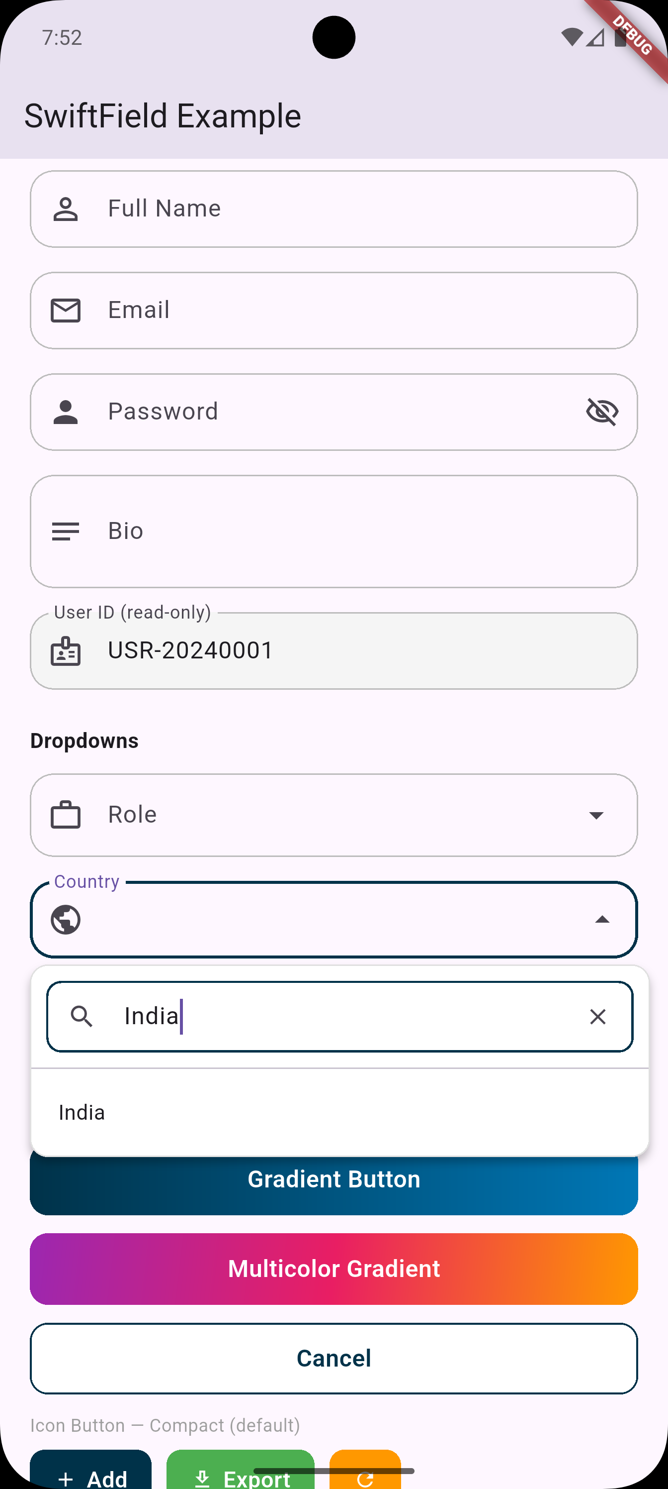
)SFDropdownSearch<String>(
labelText: 'City',
prefixIcon: Icons.location_city,
value: _selectedCity,
items: cities.map((c) => SFDropdownItem(value: c, label: c)).toList(),
onChanged: (val) => setState(() => _selectedCity = val),
searchHintText: 'Search city...',
)
// Custom filter (search by multiple fields)
SFDropdownSearch<Country>(
labelText: 'Country',
prefixIcon: Icons.public,
value: _country,
items: countries.map((c) => SFDropdownItem(value: c, label: c.name)).toList(),
onChanged: (val) => setState(() => _country = val),
filterFn: (item, query) =>
item.label.toLowerCase().contains(query.toLowerCase()) ||
item.value.code.toLowerCase().contains(query.toLowerCase()),
)// Quick-style — identical to before
SFButton(text: 'Submit', onPressed: _submit)
SFButton(text: 'Loading', onPressed: _save, isLoading: _isSaving)
SFButton(
text: 'Gradient',
onPressed: _next,
gradient: LinearGradient(colors: [Color(0xFF003249), Color(0xFF0077B6)]),
)
SFButton(
text: 'Cancel',
onPressed: _cancel,
backgroundColor: Colors.white,
textColor: Color(0xFF003249),
borderColor: Color(0xFF003249),
)
// Per-state theming
final btnBase = SFButtonTheme(
backgroundColor: Color(0xFF003249),
borderRadius: 14,
height: 52,
);
SFButton(
text: 'Submit',
onPressed: _submit,
isLoading: _isLoading,
defaultTheme: btnBase,
pressedTheme: btnBase.copyWith(backgroundColor: Color(0xFF00213A)),
loadingTheme: btnBase.copyWith(backgroundColor: Colors.grey),
disabledTheme: btnBase.copyWith(backgroundColor: Colors.grey.shade300),
hoveredTheme: btnBase.copyWith(elevation: 4), // desktop / web
hapticFeedback: SFButtonHaptic.light,
prefixIcon: Icons.send,
)
// Gradient per-state
final gradBase = SFButtonTheme(
gradient: LinearGradient(colors: [Colors.purple, Colors.pink]),
borderRadius: 14,
);
SFButton(
text: 'Continue',
onPressed: _next,
defaultTheme: gradBase,
pressedTheme: gradBase.copyWith(
gradient: LinearGradient(colors: [Colors.purple.shade800, Colors.pink.shade800]),
),
)// Quick-style — identical to before
SFIconButton(text: 'Add', icon: Icons.add, onPressed: _add)
SFIconButton(icon: Icons.refresh, onPressed: _refresh, backgroundColor: Colors.orange)
SFIconButton(
text: 'Continue',
icon: Icons.arrow_forward,
onPressed: _next,
mode: SFIconButtonMode.expanded,
)
// Icon positions
SFIconButton(
text: 'Upload',
icon: Icons.upload,
onPressed: _upload,
iconPosition: SFIconPosition.top, // icon above text
mode: SFIconButtonMode.expanded,
)
SFIconButton(
text: 'Next',
icon: Icons.arrow_forward,
onPressed: _next,
iconPosition: SFIconPosition.end, // icon on the right
)
// Per-state theming
final iconBase = SFIconButtonTheme(
backgroundColor: Color(0xFF003249),
borderRadius: 10,
height: 44,
);
SFIconButton(
text: 'Export',
icon: Icons.download_outlined,
onPressed: _export,
defaultTheme: iconBase,
pressedTheme: iconBase.copyWith(backgroundColor: Color(0xFF001F30)),
loadingTheme: iconBase.copyWith(backgroundColor: Colors.grey),
disabledTheme: iconBase.copyWith(backgroundColor: Colors.grey.shade300),
hapticFeedback: SFButtonHaptic.selection,
)📖 Full documentation: SF_PIN_CODE_README.md
final defaultTheme = SFPinTheme(
  width: 56,
  height: 56,
  textStyle: TextStyle(fontSize: 20, fontWeight: FontWeight.w600),
  decoration: BoxDecoration(
    border: Border.all(color: Color(0xFFEAEFF3)),
    borderRadius: BorderRadius.circular(20),
  ),
);

SFPinCode(
  length: 6,
  defaultSFPinTheme: defaultTheme,
  focusedSFPinTheme: defaultTheme.copyDecorationWith(
    border: Border.all(color: Color(0xFF72B2EE), width: 2),
    borderRadius: BorderRadius.circular(8),
  ),
  submittedSFPinTheme: defaultTheme.copyWith(
    decoration: defaultTheme.decoration!.copyWith(color: Color(0xFFEAEFF3)),
  ),
  validator: (s) => s == '123456' ? null : 'Incorrect code',
  sfPinAutovalidateMode: SFPinAutovalidateMode.onSubmit,
  showCursor: true,
  onCompleted: (pin) => print(pin),
)| Model | Used by | States |
|---|---|---|
SFFieldTheme |
SFTextField, SFPasswordField |
default, focused, filled, error, disabled |
SFButtonTheme |
SFButton |
default, pressed, hovered, loading, disabled |
SFIconButtonTheme |
SFIconButton |
default, pressed, hovered, loading, disabled |
SFPinTheme |
SFPinCode |
default, focused, submitted, following, error, disabled |
All theme models share the same pattern:
copyWith(...)— change any propertycopyColorWith(...)— change only colorsapply(other)— merge, filling nulls from another theme
// SFTextField / SFPasswordField — fires on focus gained
SFTextField(hapticFeedback: SFFieldHaptic.light, ...)

// SFButton / SFIconButton — fires on tap
SFButton(hapticFeedback: SFButtonHaptic.medium, ...)| Enum | Values |
|---|---|
SFFieldHaptic |
none, light, medium, heavy, selection |
SFButtonHaptic |
none, light, medium, heavy, selection |
Zero external dependencies. SwiftField uses only Flutter's built-in Material 3 widgets:
DropdownMenu(Flutter 3.7+) for dropdowns and searchTextFormField,FormFieldfor text inputsSFPinCodeis self-contained — no additional packages required for basic usage
MIT